Brand Identity for Small Businesses: Building One Look From Shop Sign to Website
A step-by-step guide to brand identity design for small businesses: logo, colours, fonts, brand guidelines and keeping one consistent look in store and online.
By Amanda Matondo · · 7 min read

Key takeaways
- A brand identity is a system, not just a logo.
- Consistency across every touchpoint builds recognition and trust.
- Simple brand guidelines keep staff and suppliers on the same page.
- Your receipt, website and packaging are all part of your brand.
A brand identity is more than a logo
When owners think of branding, they usually think of a logo. The logo matters, but it is only one piece. A brand identity is the full set of visual and verbal choices that make your business recognisable: logo, colours, fonts, photography style, tone of voice and the way these come together on everything a customer sees.
Think of the businesses you recognise instantly. You know them from a colour, a shape on a bag or the feel of their website, often before you read the name. That instant recognition is what a good identity system creates.
Why consistency builds trust
Customers meet your business in many places: the shop sign, a social media post, the website, the card terminal screen, the receipt and the bag they carry home. When all of these look and sound like the same business, people remember you and trust you more.
When they do not match, with a different logo on the website, other colours on the menu and a generic receipt, the business looks less established than it really is. Inconsistency quietly costs you credibility, especially with new customers.
The building blocks of a visual identity
A complete identity usually includes the following elements. Small businesses do not need all of them on day one, but they should be planned together so they work as a family.
- Logo, with versions for wide, square and very small spaces
- Colour palette with main, supporting and accent colours
- Typography: a heading font and a body font
- Photography and illustration style
- Icons and graphic patterns
- Tone of voice: how your brand writes and speaks
Designing a logo that works everywhere
A strong logo is simple enough to recognise at a glance and to reproduce anywhere: on a tiny app icon, a printed receipt, an embroidered shirt and a large shop sign. Complex details and thin lines disappear at small sizes and cost more to print.
Ask for several versions: a full logo with the name, a compact symbol for social media and app icons, and one-colour versions for printing on dark or light backgrounds. Always test the logo in black and white; if it still works, it is strong.
Choosing colours and fonts
Colours carry emotion and help people recognise you quickly. Choose one or two main colours and a few supporting ones. Make sure text on your colours is easy to read; strong contrast is essential for accessibility on websites and screens.
For fonts, two are usually enough: one with character for headings and one that is very readable for body text. Check that your fonts work on the web and that you have the licences to use them in print, online and in apps.
Every touchpoint is part of your brand
Make a list of every place a customer meets your business, then check whether each one looks like you. Many owners are surprised by how many touchpoints they forget.
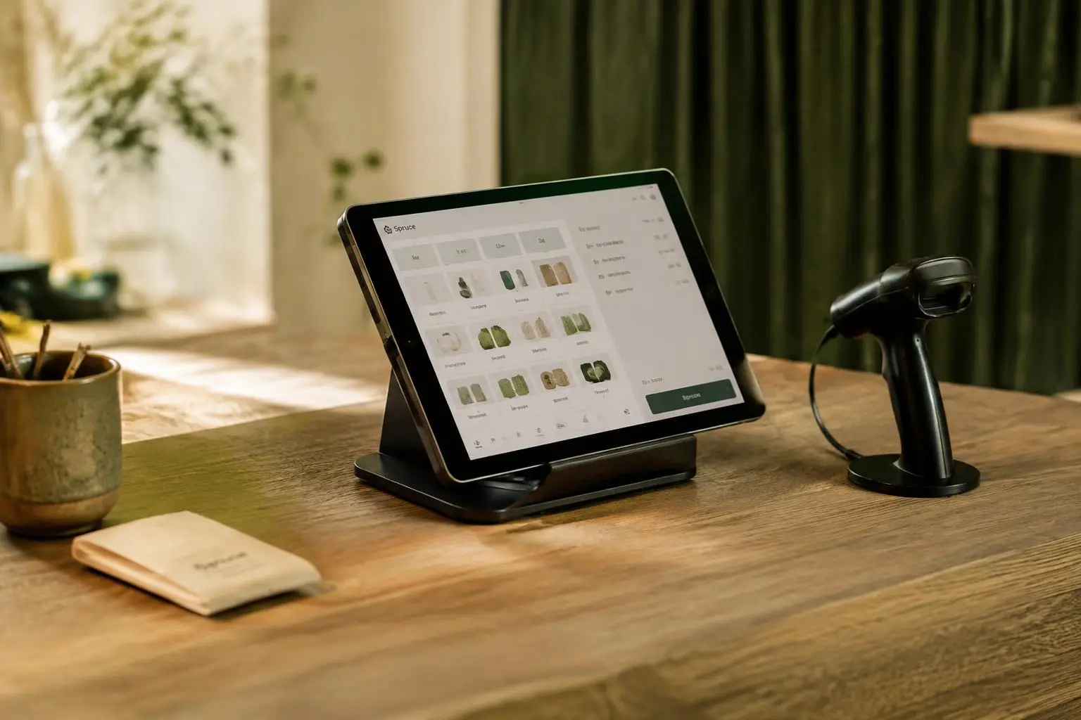
Digital receipts are a good example. A plain receipt from a generic till is a missed opportunity. A receipt sent on WhatsApp with your logo, colours and a friendly line feels like part of the experience. Because Yoodz builds POS systems and websites as well as brands, we carry the identity into the till screen, receipts and online shop at the same time.
- Shop sign, windows and interior
- Packaging, bags and labels
- Website and online shop
- Social media profiles and posts
- POS screens and receipts
- Business cards, invoices and email signatures
- Staff uniforms and name badges
Brand guidelines: the rulebook that keeps things consistent
Brand guidelines are a short document that explains how to use your identity. They show the correct logo versions and spacing, the exact colour codes for print and screens, the fonts and how to use them, and examples of what to do and avoid.
Guidelines make life easier for everyone who works on your brand: staff making social posts, printers producing signs and developers building your website. Keep them practical. A clear twenty-page guide that people use beats a hundred-page book nobody opens.
The brand identity design process
A professional identity project usually follows clear stages. It starts with discovery: understanding your business, customers, competitors and goals. Then the designer explores a few creative directions and presents them with examples of how they would look in real use.
After you choose a direction, it is refined, tested on real touchpoints and finalised. The project ends with ready-to-use files for print and digital, plus the brand guidelines. At Yoodz this typically takes three to five weeks.
- Discovery and research
- Creative directions with real-life mockups
- Refinement and testing
- Final files and brand guidelines
When to refresh or rebrand
Not every business needs a full rebrand. A refresh keeps what customers already recognise and modernises it: a cleaner logo, updated colours, better fonts for screens. A full rebrand makes sense when the business has changed direction, merged, moved into a new market or when the current identity is causing confusion.
Whatever you choose, roll it out in a planned order so customers see a clear change rather than a mix of old and new for months.
Tone of voice: how your brand sounds
Your identity is not only visual. The words you use on signs, menus, social posts, emails and even error messages on your website shape how people feel about you. A bakery might sound warm and playful; a law firm calm and precise. Neither is wrong, but each should be consistent.
Write down three or four words that describe how you want to sound, with a short example of each. For instance: friendly, not childish; confident, not arrogant; simple, not basic. Share these with everyone who writes for the business. A few clear rules prevent the mixed messages that confuse customers.
Look at the small texts too. The line at the bottom of a receipt, the confirmation message after an order and the automatic reply to an email are all moments where a consistent voice makes your business feel cared for.
How to budget for brand identity
Branding costs vary widely, from cheap logo contests to large agency projects. For a small business, the best value usually sits in between: a professional designer or studio that delivers a complete, usable system rather than a single logo file.
When comparing quotes, check exactly what is included. How many creative directions will you see? How many rounds of changes? Will you receive guidelines and templates, or only a logo? Who owns the final files? A low price that leaves you without the files and rules you need often costs more later, when every new sign or post needs a designer to guess how your brand should look.
Also plan the rollout budget: new signage, printed materials, packaging and website updates. Spreading the rollout over a few months is fine, as long as it follows a clear plan and the most visible touchpoints change first.
- Number of creative directions and revision rounds
- Guidelines and templates included
- Full file ownership and usage rights
- Budget for signs, print and website rollout
Measuring whether your brand is working
Brand results are harder to count than sales, but there are useful signals. Watch whether more people search for your business by name, whether social posts are recognised and shared, whether customers mention your look or packaging in reviews and whether staff find it easier to create materials. Over time, a strong identity makes every campaign cheaper, because people already know who you are.
Collect a simple before-and-after picture as well: photos of your old and new signs, packaging and website. Seeing them side by side helps the whole team understand why consistency matters and keeps everyone proud of the new look.
The files you should receive
At the end of a brand project, make sure you have everything needed to use your identity without going back to the designer for every small task.
- Logo files in vector (SVG, PDF) and image (PNG) formats
- Colour codes for print (CMYK) and screens (HEX, RGB)
- Font files or licence details
- Templates for social posts and documents
- The brand guidelines document
- Full ownership and usage rights
Need help with this?
See how Yoodz handles brand identity for growing businesses, or book a free call.
Frequently asked questions
- What is the difference between a logo and a brand identity?
- A logo is one mark. A brand identity is the complete system: logo, colours, fonts, imagery and tone, used consistently everywhere.
- How long does brand identity design take?
- A typical small business identity takes three to five weeks, from discovery to final files and guidelines.
- Do small businesses need brand guidelines?
- Yes. Even a short guide keeps staff, printers and web developers consistent, which saves time and builds recognition.